
How to Print a QR Code
A QR code that works perfectly on a screen can come out of a printer dead. The reasons are boringly physical — ink spreads, paper absorbs, toner streaks — and every one of them is avoidable at the design stage.
Start with the right file
Send vector — PDF, SVG or EPS — to anyone with a professional press. A QR code is a set of exact rectangles, and vector formats keep them exact at every size. If the workflow only accepts a bitmap, generate the PNG at the final printed size rather than scaling one up later; the arithmetic is in the printing size guide.
Never JPEG. JPEG compression is designed to be invisible in photographs, and it works by smoothing exactly the kind of hard black-and-white boundary a QR code consists of. The damage is subtle on screen and fatal at small sizes.
One refinement worth asking your printer about: make each module land on a whole number of printer dots. A 29-module code printed 30 mm wide at 300 dpi gives 12.2 dots per module, and that fractional 0.2 shifts along the row, so some module edges land on a dot boundary and some do not. Nudging the width so it comes out at exactly 12 dots per module gives visibly cleaner edges. On thermal label printers, which are often 203 dpi, this matters a great deal.
Contrast, and what we actually measured
The standard advice is that a QR code needs strong contrast. We wanted to know how strong, so we generated the same code with the dark modules stepped from black through progressively lighter greys and ran each through a simulated camera, 40 attempts per step.
The result was not what we expected. The decoder read the code reliably far below the contrast ratios usually recommended — down to about 2:1, which is a mid-grey on white and looks washed out to the eye. Even adding a strong illumination gradient across the frame did not change it much.
That is a measured result on synthetic images, and it comes with a caveat that matters. Real failures at low contrast come from things our model does not reproduce — specular reflections on laminate, coloured ink on coloured stock, a phone's aggressive noise reduction in a dim restaurant. So the practical advice does not change: print dark modules as near black as the process allows, on the lightest stock you have. What changes is where you spend your worry. If a code is failing, the module size or the print quality is a far more likely culprit than the greyness of the ink.
Two things that genuinely do break contrast, rather than merely reducing it:
- Colour combinations that are dark to the eye but similar to a sensor. Red on black, dark blue on dark green. If the two colours have similar luminance, converting to greyscale — which is the first thing a decoder does — leaves almost nothing.
- Gloss and lamination. A reflection lands on part of the symbol and blows it to white. Matt laminate, or angle the code away from overhead lighting.
Do not invert the code
Light modules on a dark background look excellent on a poster. We tested it: zero successful reads, out of every attempt, with the decoder we used.
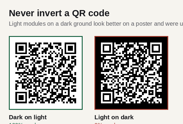
Some decoders do try both polarities, so an inverted code will work for some people. That is exactly the problem: it will work on the designer's phone and fail for a fraction of the audience, silently, with no way for you to find out. If the design needs a dark panel, put a light plate behind the code — extending four modules past it on every side — and keep the code the right way round.
Ink spread and the small-code trap
Ink spreads into paper. On uncoated or recycled stock, each dark module ends up fractionally wider than designed, and each light module fractionally narrower. At 30 mm the effect is invisible. At 12 mm, where a module might be 0.35 mm across, a 0.05 mm bleed is a 14% distortion on every single edge.
That distributed, everywhere-at-once damage is the worst kind for error correction. Our damage tests found that scattered damage is four to seven times more destructive than the same area concentrated in one blot — the numbers are in error correction explained. Ink spread is the definitive scattered case, which is why a code can look perfect and still fail.
What helps:
- Coated stock if you have the choice. Less absorption, less spread.
- Make the code bigger. The single most reliable fix. Bleed is roughly constant in absolute terms, so it hurts proportionally less as modules get wider.
- Ask the printer about dot gain compensation. Commercial presses can be adjusted for it; most people never ask.
- Do not compensate by raising the error-correction level. It adds modules, which makes each module smaller, which makes bleed proportionally worse. It is the wrong lever for this problem.
Printing on things that are not paper
| Surface | What goes wrong | What to do |
|---|---|---|
| Corrugated card | Flutes distort the grid | Print across the flutes, not along; go 30% bigger |
| Fabric and apparel | Weave scatters module edges | Level H, minimum 40 mm, avoid textured weaves |
| Curved bottles and tins | Grid warps out of square | Keep the code under a third of the circumference |
| Glossy laminate | Reflections wipe out regions | Matt finish, or angle away from lighting |
| Thermal labels | 203 dpi, coarse dots | Whole dots per module; test the actual printer |
| Engraved metal | Low contrast, specular glare | Bead-blast the background; contrast beats depth |
| Vinyl vehicle wrap | Flexes and stretches | Flat panels only; never across a body crease |
Curved surfaces deserve one extra note. The alignment patterns inside a code exist to correct for exactly this kind of warp, and there are more of them in bigger symbols — so on a bottle or a jar, a larger code is not just easier to see, it is structurally better equipped to be read. Codes on product packaging goes into this in detail.
Test the print, not the file
The last step is the one that gets skipped. Print the proof, then:
- Scan it with the oldest phone you can find, not the newest.
- Scan it at the real distance, in the real lighting — the restaurant at dinner, not the studio.
- Scan it with the phone's native camera app, not a dedicated QR app. Native cameras are what people use and they are often less capable.
- Scan it at an angle, roughly 30° off perpendicular, which is how a code on a table is really approached.
- Check the code goes where you think. A working code pointing at a staging URL is still a failure.
The full pre-print checklist has twelve of these, in order.
Written by Manuel Llovet, who builds and maintains QR Code Free Forever. Published 2026-08-31, last checked 2026-09-08. Figures and measurements on this page were produced for this site; the method is described in each caption.